Just a few weeks ago, predictions of Arctic ice collapse were buzzing all over the internet. Some scientists were predicting that the "North Pole may be ice-free for first time this summer". Others predicted that the entire "polar ice cap would disappear this summer".
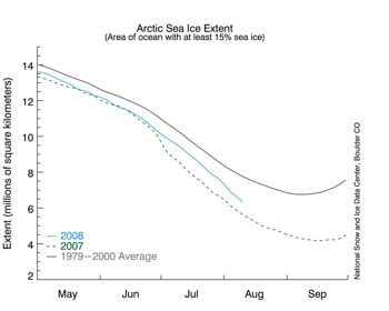
The National Snow and Ice Data Center (NSIDC) in Boulder, Colorado released an alarming graph on August 11, showing that Arctic ice was rapidly disappearing, back towards last year's record minimum. Their data shows Arctic sea ice extent only 10 per cent greater than this date in 2007, and the second lowest on record. Here's a smaller version of the graph: The problem is that this graph does not appear to be correct.
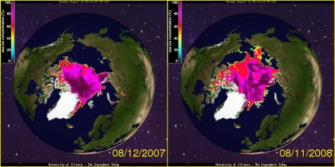
Other data sources show Arctic ice having made a nice recovery this summer. Maps of Arctic ice extent are readily available from several sources, including the University of Illinois, which keeps a daily archive for the last 30 years. A comparison of these maps (derived from NSIDC data) below shows that Arctic ice extent was 30 per cent greater on August 11, 2008 than it was on the August 12, 2007. (2008 is a leap year, so the dates are offset by one.)
So how did NSIDC calculate a 10 per cent increase over 2007? Their graph appears to disagree with the maps by a factor of three (10 per cent vs. 30 per cent) - hardly a trivial discrepancy.
And what of the Antarctic? Down south, ice extent is well ahead of the recent average. Why isn't NSIDC making similarly high-profile press releases about the increase in Antarctic ice over the last 30 years?
[A: funding]
READ MORE
Wednesday, August 20, 2008
Arctic ice refuses to melt as ordered
Subscribe to:
Post Comments (Atom)


No comments:
Post a Comment