


The story is that the world is heating up - fast. Prominent people at NASA warn us that unless we change our carbon producing ways, civilisation as we know it will come to an end. At the same time, there are new scientific studies showing that the earth is in a 20 year long cooling period. Which view is correct? Temperature data should be simple enough to record and analyze. We all know how to read a thermometer - it is not rocket science. [snip]
Previously we looked at how US temperature data sets have been adjusted - with more recent versions of historical data sets showing a steeper rise in temperature than they used to. Here, we'll be looking at current NASA data and why their temperature maps appear hot-red, even when others are cool-blue. [graph at site - it trends up {surprise}]
We observe that the data has been consistently adjusted towards a bias of greater warming. The years prior to the 1970s have again been adjusted to lower temperatures, and recent years have been adjusted towards higher temperatures.
[two temprature maps, at site, basically showing...]
Prior to any adjustments, more than half the US shows declining temperatures over the 20th century - blue and green colors - i.e. the US is cooling down. However, subsequent to the adjustments the country goes dominantly warmer (red and yellow)... [snip]
So how does NASA's data compare with other temperature sources? As we explained in our earlier article, NASA data is derived from a grid of ground-based thermometers. During the last thirty years, we also have the benefit of more sophisticated technology - satellites which can indirectly record temperatures across most of the planet. The satellite data is from Remote Sensing Systems (RSS) and the University of Alabama at Huntsville (UAH) [the money graph]: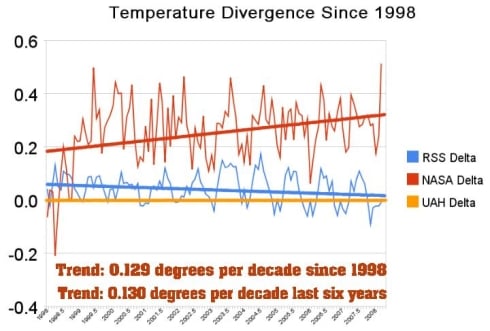 The divergence is now quite striking. Looking closer at March 2008, NASA's data shows the month as the third warmest on record. In sharp contrast, UAH and RSS satellite data showed March as the second coldest on record in the southern hemisphere, and just barely above average for the whole planet. How could such a large discrepancy occur? [snip]
Dr. James Hansen at GISS is the person in charge of the NASA temperature data. He is also the world's leading advocate of the idea of catastrophic global warming, and is Al Gore's primary climate advisor. The discrepancies between NASA and other data sources can't help but make us consider Einstein's advice:
"If the facts don't fit the theory, change the facts."
[ much more data carefully deconstructing the assertions by demonstrating how NASA's data was the product of compiling layer upon layer of questionable science upon equally questionable asumptions - longish, but Highly Recommended for anyone not aware/disbelieving of how this game is being played > ]
READ MORE
Friday, June 6, 2008
Painting by numbers: NASA's peculiar thermometer
![]()
![]()
Subscribe to:
Post Comments (Atom)


No comments:
Post a Comment